
Today’s world is more data-driven than ever before.
From social media interactions to online purchases, every digital action generates data that can be analyzed and used to gain insights.
Businesses are collecting and analyzing data to understand their customers’ behavior, optimize their operations and stay ahead of the competition. In order to overpower the competitive market, use the power of business intelligence that helps you stay updated on industry trends.
Business intelligence helps you to transform the raw data into valuable real-time insights and share it with your team and stakeholders to foster a culture of innovation.
Easily identify new opportunities and adjust your strategy to stay ahead of the competition with the help of business intelligence tools & technologies.
This is where Power BI comes in – a powerful self-service business intelligence tool that allows you to create stunning data visualizations and interactive reports.
Power BI is not just about creating pretty charts and graphs – it’s about using these visualizations to tell a compelling story with your data.
In this blog, Power BI experts at VC ERP Consulting, will explore the art of storytelling with data visualization using Power BI. We will share some tips and tricks for creating impactful visualizations that engage and inform your audience.
What is Data Visualization in Power BI?
Data visualization is a method of presenting information through visual images, which provide a graphical representation of the data collected. Make informed business decisions by presenting raw data in the form of charts, graphs, diagrams, spreadsheets, maps and numbers.
There are two types of data visualization in Microsoft Power BI: explanatory and exploratory.
Explanatory visuals, also referred to as informative, focus on communicating specific aspects or the entire story to the audience.
In contrast, exploratory visuals are utilized when you are uncertain about the questions that need to be answered with the data you have collected.
Data visualization enables you to present a more comprehensive narrative to your audience, allowing them to identify correlations, spot trends, and draw their own conclusions or form their own opinions.
However, it’s crucial to recognize that presenting data analytics through visualization alone, without contextual storytelling, may result in your audience delaying their decision-making, arriving at incorrect conclusions, or becoming overwhelmed by the vast amounts of data.
Incorporate effective storytelling with data visualization to ensure that your message is effectively conveyed and understood by your audience.
What is Data Storytelling in Power BI?
Throughout human history, storytelling has been the primary mode of communication. Whether conveyed orally or visually, humans have relied on storytelling as a means of achieving effective communication. Now, it is the turn of data to tell a story.
Data storytelling in Power BI involves using the data and analytics you have collected to create a narrative that supports your hypothesis. The goal is to present a cohesive story that delivers a final message and suggests an actionable step, just like telling a story verbally to someone.
Data storytelling relies on various types of data to craft a compelling story such as scatter plots, geographic maps, timelines, line graphs, pie charts, bar charts, heat maps, and tree charts.
Before creating your data story, you should determine the following:- The specific information that you want your users to gain from your data
- The specific action(s) that you want your users to take as a result of understanding your data
- The narrative or storyline that will help motivate and drive users towards taking those actions
- How your data is directly relevant and influential in facilitating those decisions and actions
- Once you are clear as to what you want to convey through your story, let us take a look at the principles of data storytelling
The Power of Storytelling with Microsoft Power BI: A Framework for Success
Microsoft Power BI is a powerful data visualization and analysis tool that can help you create compelling data stories. In order to craft a compelling data story in Power BI, it is crucial to have a clear beginning, middle, and end.
You must have a clear idea of the narrative you wish to convey and how you plan to navigate it.
Familiarity with the background and outcomes of your data analysis will provide you with the essential information required to narrate your story.
Create a framework that facilitates effective data visualization and storytelling by adopting some best practices. Here are a few practical methods to ensure the success of your data visualization and storytelling:- Prioritize the key messages and insights that you want to convey through the data story and focus on highlighting these points throughout the narrative
- Craft a story that is both captivating and relevant to your audience’s interests by understanding what they want to hear
- Integrate essential components of storytelling –
- Plot – The types of questions presented, how you’ll answer them, and how you’ll help your audience arrive at the conclusion
- Context – How your audience interprets the data you present
- Characters – The tone and insights into how you’ll tell the story
- The end – The conclusion and subsequent actions resulting from your story
- Ensure that your presentation of data is impartial and unbiased, clearly displaying all relevant information without any confusion
- Present your information with suitable visualizations
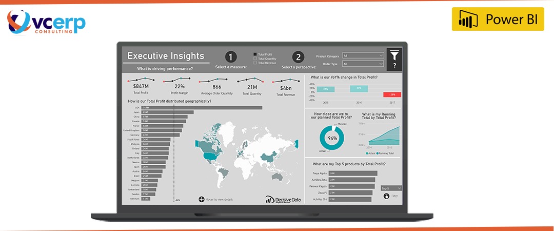
Implement Microsoft Power BI with VC ERP Consulting to bridge the gap between your narrative and data experiences. Discover meaningful content, unlock crucial business insights, and collaborate and share data reports with your team using advanced data visualization and storytelling capabilities.
Harness the Potential of Your Data with VC ERP Consulting Today
Microsoft Power BI is an incredibly powerful tool for data storytelling and data visualization. It provides users with a wide range of options for visualizing and presenting data, from basic charts and graphs to more complex dashboards and reports.
Utilize Power BI’s features to create compelling and impactful data visualizations that effectively communicate complex information to stakeholders.
In summary, if you’re looking to take your data storytelling and data visualization to the next level, Microsoft Power BI is an excellent tool to consider. Implement Power BI with VC ERP Consulting today.
Get in touch with our expert Power BI Consultants & advisors at VC ERP Consulting.
Call +91 7948998911 (India), Whatsapp +254 111229970 (Kenya), Call +1 469 9156026 (North America), +974 31239246 (MENA) or drop an E-mail at sayhello@vc-erp.com

